Fifty Solitaires – Laying it Out

Posted 3rd May 2024 by Holger
The last time I wrote about my Fifty Solitaires project, I focused on updating all my package dependencies and making sure that my components still worked when using newer versions of React and Storybook. This time, I will make some progress by creating the Tableau component. In Solitaire, the Tableau is the area where the cards are laid out. Each pile of cards has a specified location and rules on which cards are visible and how cards can be taken or dropped onto the pile. For the scope of this post, I will keep the Tableau component relatively simple. In previous posts, I already created the Card and Pile components. For now, the Tableau will simply consist of a set of Piles laid out on a rectangular grid. The rules for moving and uncovering cards will be implemented in a later post.
The Grid
In the first step, I think about the information I will need to display the Tableau. I can already display piles of cards using the Pile component and the properties passed into the Pile component is defined by PileProperties. To display a pile on the Tableau, I will also need the location of the Pile. The natural way of determining the position, is to think of the Tableau as a rectangular grid with rows and columns. Each Pile will have a row and column number. This leads me to define PileDisplayProperties in the following way.
import { PileProperties } from "./Pile";

export interface PileDisplayProperties extends PileProperties {
    row: number;
    col: number;
}
I am adding this code to a new file in src/components/Tableau.tsx. The TableauProperties will be the datatype passed into the Tableau component. This consists of an array of piles specified by PileDisplayProperties and a total number of rows and columns of the grid.
export interface TableauProperties {
    rows: number;
    cols: number;
    piles: PileDisplayProperties[];
}
The natural way to lay out the Tableau component in CSS is by using the display: grid property. This is a relatively new layout concept in CSS but it has been around for a while and is supported by all modern browsers. I’ll jump ahead a bit and first show you the CSS for the Tableau so that the implementation of the component makes sense. In a new file, src/components/Tableau.css, I placed the following code.
.solitaire-tableau {
    display: grid;
    background-color: #009900;
    position: relative;
}
This simply sets the display property to grid and also sets a nice green background color, representative of the green felt usually found on card game tables. If you are unfamiliar with the grid layouts in CSS, I find the Complete Guide to CSS Grid on CSS-Tricks a very useful starting point. You will notice that a grid usually needs column and row definitions. These are missing from my CSS file because they depend on the rows and cols parameters passed into the component.
The Tableau Component
Using this CSS, and the type definitions above, I can now create the Tableau component in src/components/Tableau.tsx.
import './Tableau.css';

export function Tableau({rows, cols, piles}: TableauProperties) {

    // some code to check the component width and set the `width` variable

    const gutter = 0.1*width/cols;
    const cellWidth = width/cols - gutter;
    const cellHeight = 1.45*cellWidth - gutter;

    const tableauStyle: CSSProperties = {
        gridTemplateColumns: `repeat(${cols}, ${cellWidth}px)`,
        gridTemplateRows: `repeat(${rows}, ${cellHeight}px)`,
        rowGap: `${gutter}px`,
        columnGap: `${gutter}px`
    };

    return (<div ref={ref} className="solitaire-tableau" style={tableauStyle}>
         {piles.map((pile, index) => {
            const pileStyle: CSSProperties = {
                gridRow: `${pile.row} / span 1`,
                gridColumn: `${pile.col} / span 1`,
                left: '0px'
            };
            return <div className="pile-container" style={pileStyle}>
                <Pile
                    pile={pile.pile}
                    direction={pile.direction}
                    key={index}
                 />
            </div>
        })}
    </div>)
}
In this component, all measures are calculated as fractions of the grid’s width, given in the width variable. You will note that I haven’t implemented how I obtain the value of this width yet. I will do that below. Each cell in the grid will have a total cell width, including gutters, of width/cols. The gutter is set 10% of this space and the remaining width for the cell is stored in cellWidth. Because the aspect ratio of the cards is constant, the cellHeight is given by the 1.45 times the cell with, subtracting the gutter again. The tableauStyle variable then contains all the CSS that is calculated dynamically based on the window width and number of columns in the grid.
The actual component is a div with class solitaire-tableau so that the CSS from the stylesheet is applied. The dynamic styles are passed in via the style attribute. The solitaire-tableau div is now styled a a CSS grid where the rows and columns are given by the parameters passed to the Tableau component. The next step is to populate those cells that contain card piles. This is done by iterating over the piles array and creating divs containing Pile components. Each of these divs gets some element CSS defining the gridRow and gridColumn CSS properties. This places each pile at the location in the grid that is defined by pile.row and pile.col.
Dynamic Width Calculation
All that’s left to do is to make sure that the width variable is set to correct width of the Tableau component. This width might change if the window resizes, so I will have to dynamically update this width. You will see that I have attached a ref attribute to the solitaire-tableau div. I now add the following code at the top inside the Tableau component, replacing the comment about the width variable.
const ref = useRef<HTMLDivElement>(null);

const [width, setWidth] = useState(0);

function autoResize() {
    const widthTot = ref.current?.parentElement?.offsetWidth ?? 0;
    const widthLoc = Math.min(widthTot, 1024);
    setWidth(widthLoc);
}

useLayoutEffect(() => {
    window.addEventListener('resize', autoResize);
    autoResize();
    return () => {
        window.removeEventListener('resize', autoResize);
    };
}, []);
width is a state variable that gets updated every time the layout changes. It is initialised using the useState hook and then set in the autoResize function. I use the ref to obtain the parent element’s width. This is given by the offsetWidth property on the element. I then limit the width of the tableau to 1024px before updating the width state with setWidth. The useLayoutEffect hook is then used to call the autoResize function. By adding the function as an an event listener to the resize event, I ensure that the width is updated every time the window size changes. Note that the return value of useLayoutEffect is a function that is used for cleanup. To avoid memory leaks, I make sure that the event listener is remove during cleanup of the Tableau component.
To make all of this work, I also need to update the imports at the top of the file. The imports in Tableau.tsx now look like this.
import { CSSProperties, useLayoutEffect, useRef, useState } from "react";
import { Pile, PileProperties } from "./Pile";
import './Tableau.css';
Viewing the Tableau in Storybook
To view the Tableau component in Storybook, I created a file src/stories/Tableau.stories.tsx. For completeness, I will paste the content of the file here although it is not very enlightening. All it does is create a few piles with cards in them and adds these piles to the TableauProperties for display. Here is the file.
import { Tableau, TableauProperties, PileDisplayProperties } from '../components/Tableau';
import { Direction } from '../components/Pile';
import { CardSuit, CardValue } from '../components/Card';

export default {
  component: Tableau,
  title: 'Components/Tableau',
};

interface StoryTableauProperties extends TableauProperties {
  style: { [key: string]: string}
}

const pileOpen: PileDisplayProperties = {
  pile: [
    { suit: CardSuit.clubs, value: CardValue.ace, faceUp: true, open: true },
    { suit: CardSuit.clubs, value: CardValue.three, faceUp: true, open: true },
    { suit: CardSuit.diamonds, value: CardValue.eight, faceUp: true, open: true },
  ],
  direction: Direction.south,
  row: 1,
  col: 1
}

const pileClosed: PileDisplayProperties = {
  pile: [
    { suit: CardSuit.clubs, value: CardValue.ace, faceUp: true, open: false },
    { suit: CardSuit.clubs, value: CardValue.three, faceUp: true, open: false },
    { suit: CardSuit.diamonds, value: CardValue.eight, faceUp: true, open: false },
  ],
  direction: Direction.south,
  row: 1,
  col: 2
}

const pileMixed: PileDisplayProperties = {
  pile: [
    { suit: CardSuit.clubs, value: CardValue.ace, faceUp: true, open: false },
    { suit: CardSuit.clubs, value: CardValue.three, faceUp: true, open: false },
    { suit: CardSuit.diamonds, value: CardValue.eight, faceUp: true, open: false },
    { suit: CardSuit.hearts, value: CardValue.jack, faceUp: true, open: true },
    { suit: CardSuit.spades, value: CardValue.four, faceUp: true, open: true },
    { suit: CardSuit.hearts, value: CardValue.seven, faceUp: true, open: true },
  ],
  direction: Direction.east,
  row: 3,
  col: 1
}

const pileFaceUpAndDown: PileDisplayProperties = {
  pile: [
    { suit: CardSuit.clubs, value: CardValue.ace, faceUp: false, open: true },
    { suit: CardSuit.clubs, value: CardValue.three, faceUp: false, open: true },
    { suit: CardSuit.spades, value: CardValue.four, faceUp: true, open: true },
    { suit: CardSuit.hearts, value: CardValue.seven, faceUp: true, open: true },
  ],
  direction: Direction.west,
  row: 1,
  col: 8
};

function Template(args: StoryTableauProperties) {
  return <div style={({
      display: 'flex',
      justifyContent: "center",
      width: "100%",
    })}>
      <div style={args.style}><Tableau {...args} /></div>
    </div>
};

export const SolitaireTableau = Template.bind({});

(SolitaireTableau as any).args = {
  piles: [
      pileClosed,
      pileOpen,
      pileMixed,
      pileFaceUpAndDown
  ],
  rows: 5,
  cols: 8,
  style: {
    width: '100%',
    backgroundColor: '#444444',
    padding: 10
  }
};
This is what the resulting tableau looks like in Storybook.
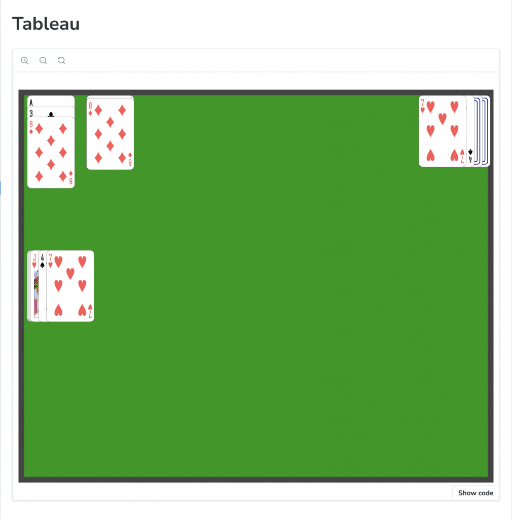
Storybook view of the Tableau Component.
Next Steps
Now that the main components have been implemented, the next step is to create a class that will drive the Solitaire gameplay. This class will specify where the piles are located on the tableau and how they behave. The aim is to make this game model very general and driven by a data structure that defines the rules of the game. By exchanging the data, different games can be created easily without writing new code.
Leave a Reply