Fifty Solitaires – Piling it Up
Posted 16th March 2022 by Holger
So here is the third instalment of my Solitaire card game. In the previous post, I created the basic Card component and set up Storybook to let me browse and test my components while developing them. Today, I will create another component that displays a collection of cards. In a Solitaire game, cards are arranged on the table in piles. The cards in the piles can be face-up or face-down. In addition, piles can be closed or open. In closed piles, each card is placed exactly on top of the previous one. In open piles, each card is placed slightly offset from the one beneath. For face-up cards, this allows the player to see the suit and value of each card in the pile. For face-down cards, it lets the player see easily how many cards are in the pile.
Face-down cards
The Card component that I created in the previous post did not allow for face-down cards. So, let’s first add the face-down feature to the existing component. The first step is to create a face-down card symbol in the SVG file that contains all the other cards. In src/assets/playing_cards.svg, I added the following symbol before the closing </svg> tag.
  <symbol id="face-down" viewBox="30 2310 360 540">
  <g
     transform="translate(30,1797.6378)"
     id="face-down">
    <rect
       rx="29.944447"
       ry="29.944447"
       y="512.86218"
       x="0.5"
       height="539"
       width="359"
       id="rect6472-45"
       style="fill:#ffffff;stroke:#000000;stroke-width:0.99999976" />
    <rect
       rx="19.944447"
       ry="19.944447"
       y="532.86218"
       x="20.5"
       height="499"
       width="319"
       id="rect6472-45"
       style="fill:none; stroke:#000088; stroke-width:5" />
    <rect
       rx="9.944447"
       ry="9.944447"
       y="552.86218"
       x="40.5"
       height="459"
       width="279"
       id="rect6472-45"
       style="fill:none; stroke:#000088; stroke-width:5" />
  </g>
  </symbol>
I tried to set the parameters of the ViewBox and the transform attributes in line with all the other symbols in the file. The face-down symbol simply consists of a white background with two rounded rectangles inside. It is probably not the most beautiful reverse side of a playing card but, given that I coded the SVG by hand, it will have to do for now.
Next, I amended the Card component in src/components/Card.tsx to allow a faceUp property to be passed in. If faceUp is true the card will be displayed as usual, and if it is false the face-down symbol will be shown. I also changed the CardProperties type to allow additional properties to be passed in.
export interface CardData {
  suit: CardSuit;
  value: CardValue;
  faceUp: boolean;
}

export interface CardProperties extends React.SVGProps<SVGSVGElement>, CardData {}

export function Card({suit, value, faceUp, ...props}: CardProperties) {
  const cardId = faceUp
    ? `${playingCards}#${value.toLowerCase()}-${suit.toLowerCase()}`
    : `${playingCards}#face-down`;
  const classNames = `${props.className} card-component`;
  return <svg {...props} className={classNames} >
    <use xlinkHref={cardId}></use>
  </svg>
}
To be able to test the new feature in Storybook, I added a faceUp: true property to the existing stories in src/stories/Card.stories.tsx. This automatically adds a switch in the Storybook stories that toggle the face-down/face-up status.
Creating the Pile
Next, I created a new component in src/components/Pile.tsx. This file contains a few bits, so I will go through it piece by piece. At the top of the file, I do some imports and type definitions.
import { Card, CardData } from "./Card";
import './Pile.css'

export interface CardDisplayProperties extends CardData {
    open: boolean;
}

export type PileData = Array<CardDisplayProperties>;

export enum Direction {
    east = 'east',
    west = 'west',
    north = 'north',
    south = 'south'
}

export interface PileProperties {
    pile: PileData;
    direction: Direction;
}
First, I imported the Card component as well as a CSS stylesheet that I yet have to create. The CardDisplayProperties interface contains all the data needed to show a card on the pile. In addition to the CardData, it contains an open flag to control if the position of the card is offset from the card below it. The PileData type is then simply an array of CardDisplayProperties. I also wanted to allow the direction of the offset to be controlled. I remember that some Solitaire variants have piles that fan out to the left or right. I just want to be prepared for this. So, I created a Direction enum that contains the four directions of the compass. Finally, the PileProperties interface is made up of the pile data and a direction.
To position the cards, the idea is to use a <div> and use absolute positioning and then place the individual cards. Each card will have a different offset from the top or left, depending on how many open and closed cards have already been placed below it. Before I continue with the code in Pile.jsx, let me first show you the CSS style in src/components/Pile.css
.card-pile {
    position: relative;
    overflow:  visible;
    width: 100%;
    height: 100%;
}

.card-pile .card {
    position: absolute;
    top: 0;
    left: 0;
}
The .card-pile class will be used for the Pile component and the .card is the CSS class of the Card component within a pile. The overflow: visible is needed so that cards can freely be placed outside the original bounding box of the pile which should just be the size of the bottom card in the pile. You can see that the top and left properties of the cards default to zero but they can be overwritten by inline styles.
Next, in src/components/Pile.tsx I defined a helper object called margins.
const margins: {[key: string]: [string, number, number]} = {
    east: [ 'left', 15, 2],
    west: [ 'left', -15, -2],
    north: [ 'top', -15, -2],
    south: [ 'top', 15, 2],
}
The object is meant to serve as a look-up from the Direction enum to an array of parameters. The first entry in the array determines the CSS property that needs to be modified, the second entry is the percentage offset for open cards, and the third entry is the percentage offset for closed cards.
Now, I am ready to create the Pile component.
export function Pile({pile, direction}: PileProperties) {
    const marginSpec = margins[direction];
    return <div className={`card-pile card-pile-${direction}`}>
        {pile.map(function cardMapper(this: {offset: number}, card, index) {
            const cardStyle = {
                [marginSpec[0]]: `${this.offset}%`
            }
            this.offset += card.open ? marginSpec[1] : marginSpec[2];
            return <Card
                className={`card ${card.open ? 'open' : ''}`}
                suit={card.suit}
                value={card.value}
                faceUp={card.faceUp}
                key={index}
                style={cardStyle} />
        }, {offset: 0})}
    </div>
}
The first line chooses the margin specifications from the margins dictionary based on the pile direction. Then inside the outer <div> the pile array is mapped to an array of Card components. I am using a less well-known feature of the Array.map function by passing {offset: 0} as a second argument after the mapper function. This argument will be attached to this inside the mapper callback. To make this work, I have to make sure that two conditions are met. First, I have to use the function keyword for the callback. This ensures that the callback has a this reference. Second, for Typescript to know the type of this, the callback function takes this as a first argument. This is compiled away in the transformation from Typescript to JavaScript and is only there to make the Typescript type system aware that this.offset exists. The offset property itself is incremented depending on the card.open flag and the margin specification.
The Story for the Pile
Now that we have completed the Pile component, we want to make it show up in Storybook as well. What follows is a slightly lengthy file that contains three stories and is stored in src/stories/Pile.stories.tsx.
import { Pile, PileProperties } from '../components/Pile';
import { CardSuit, CardValue } from '../components/Card';

export default {
  component: Pile,
  title: 'Components/Pile',
};

interface StoryPileProperties extends PileProperties {
  style: { [key: string]: string}
}

function Template(args: StoryPileProperties) {
  return <div style={({
      display: 'flex',
      justifyContent: "center",
      width: "100%",
    })}>
      <div style={args.style}><Pile {...args} /></div>
    </div>
};

export const Open = Template.bind({});

(Open as any).args = {
  pile: [
    { suit: CardSuit.clubs, value: CardValue.ace, faceUp: true, open: true },
    { suit: CardSuit.clubs, value: CardValue.three, faceUp: true, open: true },
    { suit: CardSuit.diamonds, value: CardValue.eight, faceUp: true, open: true },
],
  direction: 'south',
  style: {
    width: 200,
    height: 290,
    backgroundColor: '#444444',
    padding: 10
  }
};

export const Closed = Template.bind({});

(Closed as any).args = {
  pile: [
    { suit: CardSuit.clubs, value: CardValue.ace, faceUp: true, open: false },
    { suit: CardSuit.clubs, value: CardValue.three, faceUp: true, open: false },
    { suit: CardSuit.diamonds, value: CardValue.eight, faceUp: true, open: false },
],
  direction: 'south',
  style: {
    width: 200,
    height: 290,
    backgroundColor: '#444444',
    padding: 10
  }
};

export const Mixed = Template.bind({});

(Mixed as any).args = {
  pile: [
    { suit: CardSuit.clubs, value: CardValue.ace, faceUp: true, open: false },
    { suit: CardSuit.clubs, value: CardValue.three, faceUp: true, open: false },
    { suit: CardSuit.diamonds, value: CardValue.eight, faceUp: true, open: false },
    { suit: CardSuit.hearts, value: CardValue.jack, faceUp: true, open: true },
    { suit: CardSuit.spades, value: CardValue.four, faceUp: true, open: true },
    { suit: CardSuit.hearts, value: CardValue.seven, faceUp: true, open: true },
],
  direction: 'south',
  style: {
    width: 200,
    height: 290,
    backgroundColor: '#444444',
    padding: 10
  }
};

export const FaceUpAndDown = Template.bind({});

(FaceUpAndDown as any).args = {
  pile: [
    { suit: CardSuit.clubs, value: CardValue.ace, faceUp: false, open: true },
    { suit: CardSuit.clubs, value: CardValue.three, faceUp: false, open: true },
    { suit: CardSuit.spades, value: CardValue.four, faceUp: true, open: true },
    { suit: CardSuit.hearts, value: CardValue.seven, faceUp: true, open: true },
],
  direction: 'south',
  style: {
    width: 200,
    height: 290,
    backgroundColor: '#444444',
    padding: 10,
  }
};
There is nothing too fancy about this file. It defines a reusable Template to show the Pile component in some context. Then, each story is defined by the open and closed, and the face-up and face-down cards. I have created three stories showing different use cases. Now I can run
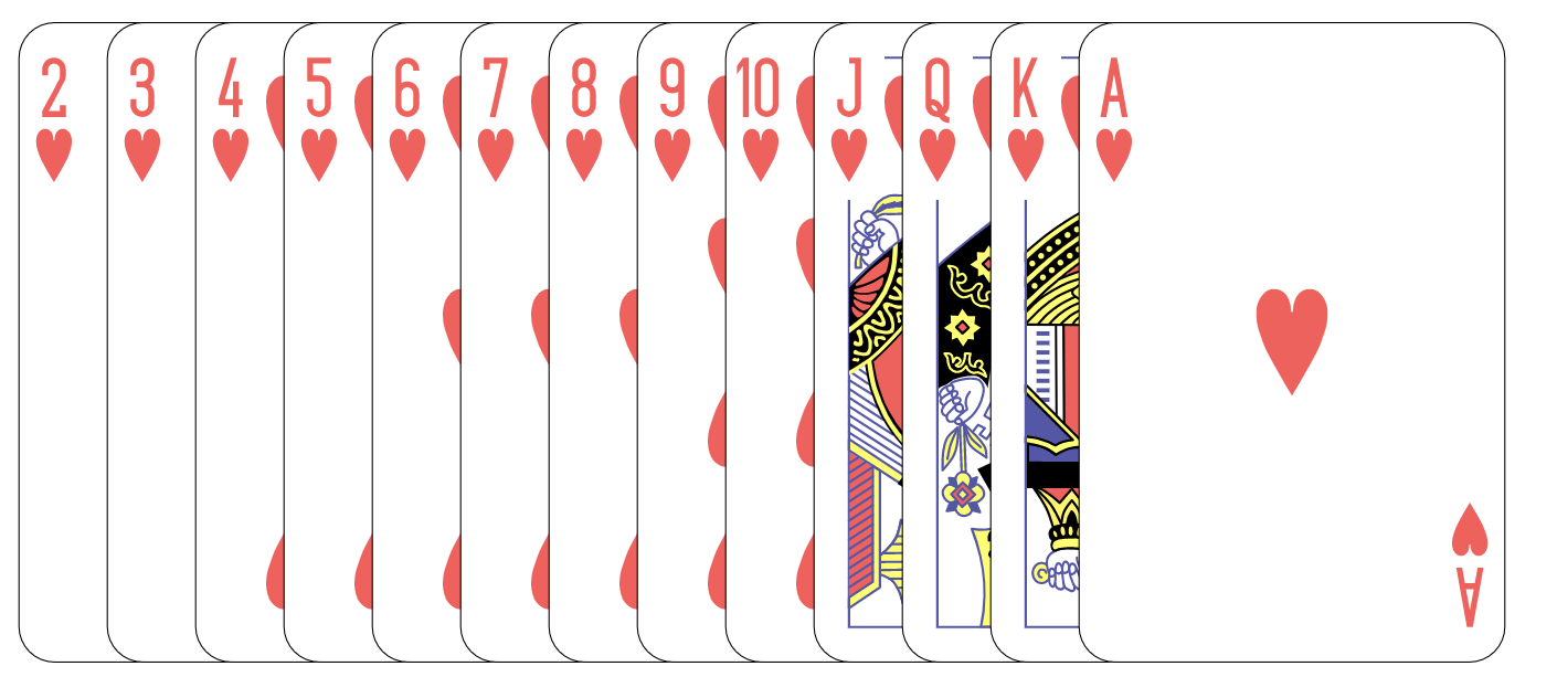
The image below shows an example of a pile feathered out to the east direction.
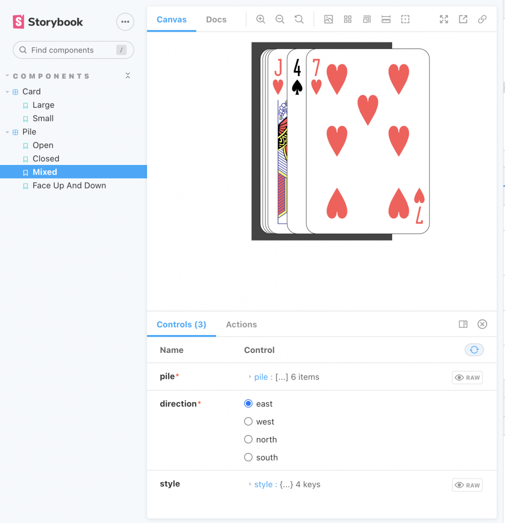
One of the stories for the Pile component in Storybook
Next Steps
Now that I have a Card component and a Pile component, I will need another component that arranges different piles on the table. This will most likely be the topic of my next post on the JavaScript Solitaire game. After that, I need to look into implementing a drag-and-drop mechanism so that the player can pick up cards from one pile and place them on another pile. When that’s done, I can start creating the game model that implements the rules of the Solitaire games.
Leave a Reply