
Fifty Solitaires – Laying it Out
Posted 3rd May 2024 by Holger Schmitz
The last time I wrote about my Fifty Solitaires project, I focused on updating all my package dependencies and making sure that my components still worked when using newer versions of React and Storybook. This time, I will make some progress by creating the Tableau component. In Solitaire, the Tableau is the area where the cards are laid out. Each pile of cards has a specified location and rules on which cards are visible and how cards can be taken or dropped onto the pile. For the scope of this post, I will keep the Tableau component relatively simple. In previous posts, I already created the Card and Pile components. For now, the Tableau will simply consist of a set of Piles laid out on a rectangular grid. The rules for moving and uncovering cards will be implemented in a later post.
The Grid
In the first step, I think about the information I will need to display the Tableau. I can already display piles of cards using the Pile component and the properties passed into the Pile component is defined by PileProperties. To display a pile on the Tableau, I will also need the location of the Pile. The natural way of determining the position, is to think of the Tableau as a rectangular grid with rows and columns. Each Pile will have a row and column number. This leads me to define PileDisplayProperties in the following way.
import { PileProperties } from "./Pile";

export interface PileDisplayProperties extends PileProperties {
    row: number;
    col: number;
}
I am adding this code to a new file in src/components/Tableau.tsx. The TableauProperties will be the datatype passed into the Tableau component. This consists of an array of piles specified by PileDisplayProperties and a total number of rows and columns of the grid.
export interface TableauProperties {
    rows: number;
    cols: number;
    piles: PileDisplayProperties[];
}
The natural way to lay out the Tableau component in CSS is by using the display: grid property. This is a relatively new layout concept in CSS but it has been around for a while and is supported by all modern browsers. I’ll jump ahead a bit and first show you the CSS for the Tableau so that the implementation of the component makes sense. In a new file, src/components/Tableau.css, I placed the following code.
.solitaire-tableau {
    display: grid;
    background-color: #009900;
    position: relative;
}
This simply sets the display property to grid and also sets a nice green background color, representative of the green felt usually found on card game tables. If you are unfamiliar with the grid layouts in CSS, I find the Complete Guide to CSS Grid on CSS-Tricks a very useful starting point. You will notice that a grid usually needs column and row definitions. These are missing from my CSS file because they depend on the rows and cols parameters passed into the component.
The Tableau Component
Using this CSS, and the type definitions above, I can now create the Tableau component in src/components/Tableau.tsx.
import './Tableau.css';

export function Tableau({rows, cols, piles}: TableauProperties) {

    // some code to check the component width and set the `width` variable

    const gutter = 0.1*width/cols;
    const cellWidth = width/cols - gutter;
    const cellHeight = 1.45*cellWidth - gutter;

    const tableauStyle: CSSProperties = {
        gridTemplateColumns: `repeat(${cols}, ${cellWidth}px)`,
        gridTemplateRows: `repeat(${rows}, ${cellHeight}px)`,
        rowGap: `${gutter}px`,
        columnGap: `${gutter}px`
    };

    return (<div ref={ref} className="solitaire-tableau" style={tableauStyle}>
         {piles.map((pile, index) => {
            const pileStyle: CSSProperties = {
                gridRow: `${pile.row} / span 1`,
                gridColumn: `${pile.col} / span 1`,
                left: '0px'
            };
            return <div className="pile-container" style={pileStyle}>
                <Pile
                    pile={pile.pile}
                    direction={pile.direction}
                    key={index}
                 />
            </div>
        })}
    </div>)
}
In this component, all measures are calculated as fractions of the grid’s width, given in the width variable. You will note that I haven’t implemented how I obtain the value of this width yet. I will do that below. Each cell in the grid will have a total cell width, including gutters, of width/cols. The gutter is set 10% of this space and the remaining width for the cell is stored in cellWidth. Because the aspect ratio of the cards is constant, the cellHeight is given by the 1.45 times the cell with, subtracting the gutter again. The tableauStyle variable then contains all the CSS that is calculated dynamically based on the window width and number of columns in the grid.
The actual component is a div with class solitaire-tableau so that the CSS from the stylesheet is applied. The dynamic styles are passed in via the style attribute. The solitaire-tableau div is now styled a a CSS grid where the rows and columns are given by the parameters passed to the Tableau component. The next step is to populate those cells that contain card piles. This is done by iterating over the piles array and creating divs containing Pile components. Each of these divs gets some element CSS defining the gridRow and gridColumn CSS properties. This places each pile at the location in the grid that is defined by pile.row and pile.col.
Dynamic Width Calculation
All that’s left to do is to make sure that the width variable is set to correct width of the Tableau component. This width might change if the window resizes, so I will have to dynamically update this width. You will see that I have attached a ref attribute to the solitaire-tableau div. I now add the following code at the top inside the Tableau component, replacing the comment about the width variable.
const ref = useRef<HTMLDivElement>(null);

const [width, setWidth] = useState(0);

function autoResize() {
    const widthTot = ref.current?.parentElement?.offsetWidth ?? 0;
    const widthLoc = Math.min(widthTot, 1024);
    setWidth(widthLoc);
}

useLayoutEffect(() => {
    window.addEventListener('resize', autoResize);
    autoResize();
    return () => {
        window.removeEventListener('resize', autoResize);
    };
}, []);
width is a state variable that gets updated every time the layout changes. It is initialised using the useState hook and then set in the autoResize function. I use the ref to obtain the parent element’s width. This is given by the offsetWidth property on the element. I then limit the width of the tableau to 1024px before updating the width state with setWidth. The useLayoutEffect hook is then used to call the autoResize function. By adding the function as an an event listener to the resize event, I ensure that the width is updated every time the window size changes. Note that the return value of useLayoutEffect is a function that is used for cleanup. To avoid memory leaks, I make sure that the event listener is remove during cleanup of the Tableau component.
To make all of this work, I also need to update the imports at the top of the file. The imports in Tableau.tsx now look like this.
import { CSSProperties, useLayoutEffect, useRef, useState } from "react";
import { Pile, PileProperties } from "./Pile";
import './Tableau.css';
Viewing the Tableau in Storybook
To view the Tableau component in Storybook, I created a file src/stories/Tableau.stories.tsx. For completeness, I will paste the content of the file here although it is not very enlightening. All it does is create a few piles with cards in them and adds these piles to the TableauProperties for display. Here is the file.
import { Tableau, TableauProperties, PileDisplayProperties } from '../components/Tableau';
import { Direction } from '../components/Pile';
import { CardSuit, CardValue } from '../components/Card';
export default {
component: Tableau,
title: 'Components/Tableau',
};
interface StoryTableauProperties extends TableauProperties {
style: { [key: string]: string}
}
const pileOpen: PileDisplayProperties = {
pile: [
{ suit: CardSuit.clubs, value: CardValue.ace, faceUp: true, open: true },
{ suit: CardSuit.clubs, value: CardValue.three, faceUp: true, open: true },
{ suit: CardSuit.diamonds, value: CardValue.eight, faceUp: true, open: true },
],
direction: Direction.south,
row: 1,
col: 1
}
const pileClosed: PileDisplayProperties = {
pile: [
{ suit: CardSuit.clubs, value: CardValue.ace, faceUp: true, open: false },
{ suit: CardSuit.clubs, value: CardValue.three, faceUp: true, open: false },
{ suit: CardSuit.diamonds, value: CardValue.eight, faceUp: true, open: false },
],
direction: Direction.south,
row: 1,
col: 2
}
const pileMixed: PileDisplayProperties = {
pile: [
{ suit: CardSuit.clubs, value: CardValue.ace, faceUp: true, open: false },
{ suit: CardSuit.clubs, value: CardValue.three, faceUp: true, open: false },
{ suit: CardSuit.diamonds, value: CardValue.eight, faceUp: true, open: false },
{ suit: CardSuit.hearts, value: CardValue.jack, faceUp: true, open: true },
{ suit: CardSuit.spades, value: CardValue.four, faceUp: true, open: true },
{ suit: CardSuit.hearts, value: CardValue.seven, faceUp: true, open: true },
],
direction: Direction.east,
row: 3,
col: 1
}
const pileFaceUpAndDown: PileDisplayProperties = {
pile: [
{ suit: CardSuit.clubs, value: CardValue.ace, faceUp: false, open: true },
{ suit: CardSuit.clubs, value: CardValue.three, faceUp: false, open: true },
{ suit: CardSuit.spades, value: CardValue.four, faceUp: true, open: true },
{ suit: CardSuit.hearts, value: CardValue.seven, faceUp: true, open: true },
],
direction: Direction.west,
row: 1,
col: 8
};
function Template(args: StoryTableauProperties) {
return <div style={({
display: 'flex',
justifyContent: "center",
width: "100%",
})}>
<div style={args.style}><Tableau {...args} /></div>
</div>
};
export const SolitaireTableau = Template.bind({});
(SolitaireTableau as any).args = {
piles: [
pileClosed,
pileOpen,
pileMixed,
pileFaceUpAndDown
],
rows: 5,
cols: 8,
style: {
width: '100%',
backgroundColor: '#444444',
padding: 10
}
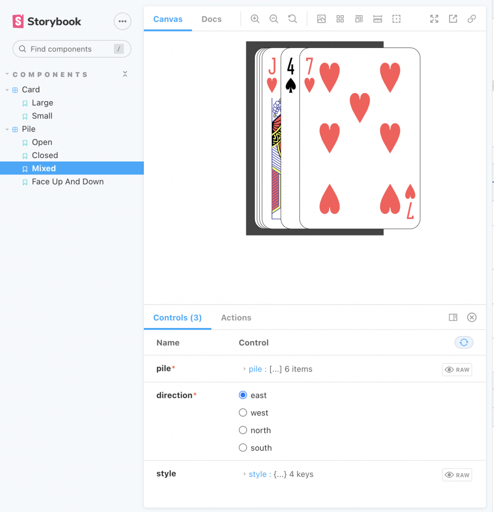
};This is what the resulting tableau looks like in Storybook.
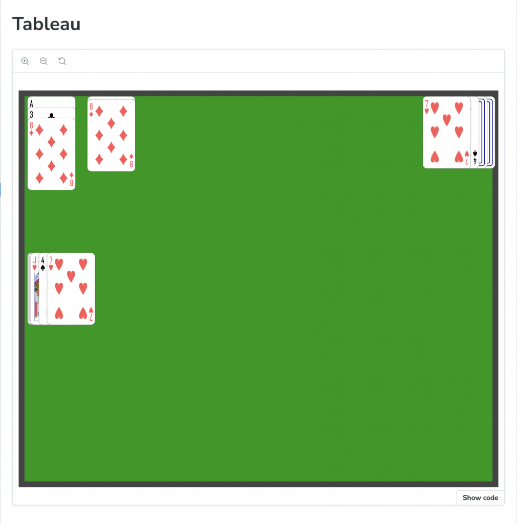
Storybook view of the Tableau Component.
Next Steps
Now that the main components have been implemented, the next step is to create a class that will drive the Solitaire gameplay. This class will specify where the piles are located on the tableau and how they behave. The aim is to make this game model very general and driven by a data structure that defines the rules of the game. By exchanging the data, different games can be created easily without writing new code.
Fifty Solitaires – The Upgrade
Posted 5th October 2023 by Holger Schmitz
It has been well over a year since I last posted about this project. I have been busy with other projects and had to leave this one on the back burner. A lot has changed since then and the first thing that I noticed when looking at this project again was that I now needed to upgrade all the project’s dependencies to their latest versions. This might not be very interesting from a software development perspective, but it is a necessary step to ensure that the project is up to date. So, this post will be all about upgrading dependencies, making adjustments to the configuration and fixing any issues that might arise.
Attempting to run the last version of the project
Before I started upgrading dependencies, I wanted to make sure that the project still worked as expected. So, I cloned the repository and ran the following commands.
npm installRight away, I got error messages from node-gyp.js when it was trying to build the binaries of node-sass. I have seen this error before and it is usually caused by the fact that the version of node-sass is not compatible with the version of Node.js that I am using. So, I checked that I currently have Node.js version 20.5.1 installed and then I checked the node-sass documentation to see that I need version 9.0.0 of node-sass. So, I updated the package.json file to use the current latest version.
"node-sass": "^9.0.0",Remember that I had already created some components and stories for Storybook, but I had not yet implemented the main application. So, I ran Storybook to see if the components would still show up as expected.
npm run storybookStorybook uses Webpack 4 to bundle the project. This emitted the following error message
Error: error:0308010C:digital envelope routines::unsupportedAgain, this is a compatibility problem with Node. On StackOverflow, I found a solution that suggested telling Node.js to enable the legacy openssl provider. This can be done by setting an environment variable.
export NODE_OPTIONS=--openssl-legacy-provider
npm run storybook
This time, Storybook started up and I could see the project in the browser. At this point, I am hoping this environment variable will not be needed once I have upgraded all the dependencies. But for now, I will leave it in place.
Upgrading dependencies
Now that I can see the Card and Pile components in Storybook, I will start upgrading the dependencies. I had two options. Either I could try to update one dependency at a time and then run Storybook each time to see if it still worked. Or I could update all the dependencies at once and then fix any issues that might arise. The problem with the first approach is that some upgrades might not be independent of each other. This could create more work, trying to figure out all the errors in the intermediate stages that wouldn’t have occurred if I had just upgraded everything at once. So, I decided to go with the second approach. To do this, I removed all entries dependencies from the package.json file. I made a note of all the packages so that I could reinstall them later.
"dependencies": {},To reinstall all the packages, I first removed the node_modules folder and the package-lock.json file. Then I ran npm install with all the packages I had noted down from the dependencies section of the package.json file.
rm -rf node_modules package-lock.json
npm install @testing-library/jest-dom @testing-library/react \
    @testing-library/user-event @types/jest @types/node @types/react \
    @types/react-dom react node-sass react-dom react-scripts \
    typescript web-vitals
Note, that I did not touch the devDependencies entry in packages.json. Looking at those entries, I saw that devDependencies only contains packages related to Storybook. This will be upgraded in a separate step. To test that the React application was still working, I ran the following command.
npm startThis worked fine. Of course, the application is only showing the default React page. Previously, I had not yet added anything to the front page because I was first focusing on creating the Card and Pile components and their Storybook stories. So, now it was time to upgrade Storybook. Fortunately, Storybook provides a command that can perform this task for you. From the documentation, I found that I should run the following command to upgrade Storybook.
npx storybook@latest upgradeThis prompted me with several questions about which migrations to run. I answered y to all of them. This step completed without any problems.
Fixing Remaining Issues
Now, it was time to check if the upgrade of Storybook had caused any issues. I ran the following command.
npm run storybookStorybook starts but then crashes. In the browser, I could only see the spinner. In the terminal, I was getting an extremely long error message that contained the full contents of my playing-cards.svg file. At the top of the error message, I see the following information.
SyntaxError: unknown: Namespace tags are not supported by default. React's JSX doesn't support namespace tags. Putting this error message into Google helped. This StackOverflow post helped me figure it out. My SVG file contains quite a few namespace tags but React does not understand namespace tags. By renaming them with a camel-cased variant I was able to get rid of the error. This was a bit tedious, but it did the trick. I am not quite sure why this was working before, but I am glad I was able to fix it.
Final Thoughts
After completing all the steps above, Storybook worked again. To double-check, I also opened a new terminal and tested Storybook without setting the NODE_OPTIONS environment variable. This means the intermediate fix for the legacy openssl provider was no longer necessary.
In conclusion, I was dreading the upgrade of the project’s dependencies. But apart from a few glitches, it turned out to be not too hard. In a previous attempt, I did not use the Storybook command and, instead, tried to upgrade Storybook manually. This did not work out so well. It shows how important it is to spend some time studying the documentation of the tools that you are using.
Starting GPU programming with Kokkos
Posted 9th March 2023 by Holger Schmitz
The high performance computing landscape has changed quite a bit over the last years. For quite a few decades, the major architecture for HPC systems was based on classical CPU processors distributed over many nodes. The nodes are connected via a fast network architecture. These compute clusters have evolved over time. A typical simulation code that makes use of this architecture will consist of more or less serial code that runs on each core and communicates with the other cores via the message passing library MPI. This has the drawback that the serial instances of the simulation code running on a shared memory node still have to exchange data through this mechanism, which takes time and reduces efficiency. On many current systems, each node can have on the order of 10s of compute cores accessing the same shared memory. To make better use of these cores, multithreading approaches, such as OpenMP, have been used increasingly over the past decade or so. However, there are not many large scale simulation codes that make use of OpenMP and MPI at the same time to reach maximum performance.
More recently, there has been new style of architecture that has become a serious player. GPU processors that used to play more of an outsider role in serious high performance computing have taken centre stage. Within the DoE’s Exascale project in the US, new supercomputers are being built that are breaking the exaflop barrier. These machines rely on a combination of traditional CPU cluster with GPU accelerators.
For developers of high performance simulation codes this means that much of their code has to be re-written to make use of the new mixed architectures. I have been developing the Schnek library for a number of years now and I am using it form many of my simulation codes. To keep the library relevant for the future, I am currently in the process of adding mixed architecture capabilities to Schnek. Fortunately, there already exists the Kokkos library which provides an abstraction layer over the different machine architectures. It also provides multi-dimensional arrays that can be stored on the host memory or on the accelerator’s device memory. It also provides iteration mechanisms to process these arrays on the CPU or GPU.
In this post, I am describing my first experiences with Kokkos and how it can be used to accelerate calculations. I will be starting from scratch which means that I will begin by installing Kokkos. The best way to do this nowadays is to use a packet manager called Spack. Spack is designed as a packet manager for supercompters but will work on any regular Linux machine. To start, I navigate into a folder where I want to install spack, let’s call it /my/installation/folder. I then simply clone Spack’s git repository.
git clone -c feature.manyFiles=true https://github.com/spack/spack.gitI am using the bash shell, so now I can initialise all the environment variables by running
source /my/installation/folder/spack/share/spack/setup-env.shThis command should be run every time you want to start developing code using the packages supplied by Spack. I recommend not putting this line into your .bashrc because some of the Spack packages might interfere with your regular system operation.
The Kokkos package has many configuration options. You can now look at them using the command
spack info kokkosI have an NVidia Quadro P1000 graphics card on my local development machine. For NVidia accelerators, I will need to install Kokkos with Cuda support. In order to install the correct Cuda version, I first check on https://developer.nvidia.com/cuda-gpus for the compute capability. For my hardware, I find that I will need version 6.1. The following command will install Kokkos and all of its dependencies.
spack install kokkos +cuda +wrapper cuda_arch=61The wrapper option is required because I am compiling everything with the gcc compiler. Note that this can take quite some time because many of the packages may be build from source code during the installation. This allows Spack packages to be highly specific to your system.
spack load kokkosNow, I can start creating my first Kokkos example. I create a file called testkokkos.cpp and add some imports to the top.
#include <Kokkos_Core.hpp>
#include <chrono>
The Kokkos_Core.hpp import is needed to use Kokkos and I also included chrono from the standard library to allow timing the code. Kokkos introduces execution spaces and memory spaces. Data can live on the host machine or the accelerator device. Similarly, execution of the code can be carried out on the serial CPU or the GPU or some other specialised processor. I want my code to be compiled for two different settings so that I can compare GPU performance against the CPU. I define two types Execution and Memory for the execution and memory spaces. These types will depend on an external macro that will be passed in by the build system.
#ifdef TEST_USE_GPU
    typedef Kokkos::Cuda Execution;
    typedef Kokkos::CudaSpace Memory;
#else
    typedef Kokkos::Serial Execution;
    typedef Kokkos::HostSpace Memory;
#endif
Kokkos manages data in View objects which represent multi-dimensional arrays. View has some template arguments. The first argument specifies the dimensionality and the datatype stored in the array. Further template arguments can be specified to specify the memory space and other compile-time configurations. For example Kokkos::View<double**, Kokkos::HostSpace> defines a two dimensional array of double precision values on the host memory. To iterate over a view, one needs to define function objects that will be passed to a function that Kokkos calls “parallel dispatch”. The following code defines three such structs that can be used to instantiate function objects.
#define HALF_SIZE 500

struct Set {
    Kokkos::View<double**, Memory> in;

    KOKKOS_INLINE_FUNCTION void operator()(int i, int j) const {
        in(i, j) = i==HALF_SIZE && j==HALF_SIZE ? 1.0 : 0.0;
    }
};

struct Diffuse {
    Kokkos::View<double**, Memory> in;
    Kokkos::View<double**, Memory> out;

    KOKKOS_INLINE_FUNCTION void operator()(int i, int j) const {
        out(i, j) = in(i, j) + 0.1*(in(i-1, j) + in(i+1, j) + in(i, j-1) + in(i, j+1)  - 4.0*in(i, j));
    }
};
The Set struct will initialise an array to 0.0 everywhere except for one position where it will be set to 1.0. This results in a single spike in the centre of the domain. Diffuse applies a diffusion operator to the in array and stored the result in the out array. The calculations can’t be carried out in-place because the order in which the function objects are called may be arbitrary. This means that, after the diffusion operator has been applied, the values should be copied back from the out array to the in array.
Now that these function objects are defined, I can start writing the actual calculation.
void performCalculation() {
    const int N = 2*HALF_SIZE + 1;
    const int iter = 100;

    Kokkos::View<double**, Memory> in("in", N, N);
    Kokkos::View<double**, Memory> out("out", N, N);

    Set set{in};
    Diffuse diffuse{in, out};
The first two line in the function define some constants. N is the size of the grids and iter sets the number of times that the diffusion operator will be applied. The Kokkos::View objects in and out store the 2-dimensional grids. The first template argument double ** specifies that the arrays are 2-dimensional and store double values. The Memory template argument was defined above and can either be Kokkos::CudaSpace or Kokkos::HostSpace. The last two lines in the code segment above initialise my two function objects of type Set and Diffuse.
I want to iterate over the inner domain, excluding the grid points at the edge of the arrays. This is necessary because the diffusion operator accesses the grid cells next to the position that is iterated over. The iteration policy uses the multidmensional range policy from Kokkos.
auto policy = Kokkos::MDRangePolicy<Execution, Kokkos::Rank<2>>({1, 1}, {N-1, N-1});The Execution template argument was defined above and can either be Kokkos::Cuda or Kokkos::Serial. The main calculation now looks like this.
    Kokkos::parallel_for("Set", policy, set);
    Kokkos::fence();

    auto startTime = std::chrono::high_resolution_clock::now();

    for (int i=0; i<iter; ++i)
    {
        Kokkos::parallel_for("Diffuse", policy, diffuse);
        Kokkos::fence();
        Kokkos::deep_copy(in,  out);
    }

    auto endTime = std::chrono::high_resolution_clock::now();
    auto milliseconds = std::chrono::duration_cast<std::chrono::milliseconds>(endTime - startTime).count();

    std::cerr << "Wall clock: " <<  milliseconds << " ms" << std::endl;
}
The function Kokkos::parallel_for applies the function object for each element given by the iteration policy. Depending on the execution space, the calculations are performed on the CPU or the GPU. To set up the calculation the set operator is applied. Inside the main loop, the diffusion operator is applied, followed by a Kokkos::deep_copy which copies the out array back to the in array. Notice, that I surrounded the loop by calls to STL’s high_resolution_clock::now(). This will allow me to print out the wall-clock time used by the calculation and give me some indication of the performance of the code.
The main function now looks like this.
int main(int argc, char **argv) {
    Kokkos::initialize(argc, argv);

    performCalculation();

    Kokkos::finalize_all();
    return 0;
}
It is important to initialise Kokkos before any calls to its routines are called, and also to finalise it before the program is exited.
To compile the code, I use CMake. Kokkos provides the necessary CMake configuration files and Spack sets all the paths so that Kokkos is easily found. My CMakeLists.txt file looks like this.
cmake_minimum_required(VERSION 3.10)

project(testkokkos LANGUAGES CXX)

set(CMAKE_CXX_STANDARD 17)
set(CMAKE_CXX_STANDARD_REQUIRED ON)
set(CMAKE_CXX_EXTENSIONS OFF)

set(CMAKE_ARCHIVE_OUTPUT_DIRECTORY ${CMAKE_BINARY_DIR}/lib)
set(CMAKE_LIBRARY_OUTPUT_DIRECTORY ${CMAKE_BINARY_DIR}/lib)
set(CMAKE_RUNTIME_OUTPUT_DIRECTORY ${CMAKE_BINARY_DIR}/bin)

find_package(Kokkos REQUIRED PATHS ${KOKKOS_DIR})
# find_package(CUDA REQUIRED)

add_executable(testkokkosCPU testkokkos.cpp)
target_compile_definitions(testkokkosCPU PRIVATE KOKKOS_DEPENDENCE)
target_link_libraries(testkokkosCPU PRIVATE Kokkos::kokkoscore)

add_executable(testkokkosGPU testkokkos.cpp)
target_compile_definitions(testkokkosGPU PRIVATE TEST_USE_GPU KOKKOS_DEPENDENCE)
target_link_libraries(testkokkosGPU PRIVATE Kokkos::kokkoscore)
Running cmake . followed by make will build two targets, testkokkosCPU and testkokkosGPU. In the compilation of testkokkosGPU the TEST_USE_GPU macro has been set so that it will make use of the Cuda memory and execution spaces.
Now its time to compare. Running testkokkosCPU writes out
Wall clock: 9055 msRunning it on the GPU with testkokkosGPU gives me
Wall clock: 57 msThat’s right! On my NVidia Quadro P1000, the GPU accelerated code outperforms the serial version by a factor of more than 150.
Using Kokkos is a relatively easy and very flexible way to make use of GPUs and other accelerator architectures. As a developer of simulation codes, the use of function operators may seem a bit strange at first. From a computer science perspective, on the other hand, these operators feel like a very natural way of approaching the problem.
My next task now is to integrate the Kokkos approach with Schnek’s multidimensional grids and fields. Fortunately, Schnek provides template arguments that allow fine control over the memory model and this should allow replacing Schnek’s default memory model with Kokkos views.
Fifty Solitaires – Piling it Up
Posted 16th March 2022 by Holger Schmitz
So here is the third instalment of my Solitaire card game. In the previous post, I created the basic Card component and set up Storybook to let me browse and test my components while developing them. Today, I will create another component that displays a collection of cards. In a Solitaire game, cards are arranged on the table in piles. The cards in the piles can be face-up or face-down. In addition, piles can be closed or open. In closed piles, each card is placed exactly on top of the previous one. In open piles, each card is placed slightly offset from the one beneath. For face-up cards, this allows the player to see the suit and value of each card in the pile. For face-down cards, it lets the player see easily how many cards are in the pile.
Face-down cards
The Card component that I created in the previous post did not allow for face-down cards. So, let’s first add the face-down feature to the existing component. The first step is to create a face-down card symbol in the SVG file that contains all the other cards. In src/assets/playing_cards.svg, I added the following symbol before the closing </svg> tag.
  <symbol id="face-down" viewBox="30 2310 360 540">
  <g
     transform="translate(30,1797.6378)"
     id="face-down">
    <rect
       rx="29.944447"
       ry="29.944447"
       y="512.86218"
       x="0.5"
       height="539"
       width="359"
       id="rect6472-45"
       style="fill:#ffffff;stroke:#000000;stroke-width:0.99999976" />
    <rect
       rx="19.944447"
       ry="19.944447"
       y="532.86218"
       x="20.5"
       height="499"
       width="319"
       id="rect6472-45"
       style="fill:none; stroke:#000088; stroke-width:5" />
    <rect
       rx="9.944447"
       ry="9.944447"
       y="552.86218"
       x="40.5"
       height="459"
       width="279"
       id="rect6472-45"
       style="fill:none; stroke:#000088; stroke-width:5" />
  </g>
  </symbol>
I tried to set the parameters of the ViewBox and the transform attributes in line with all the other symbols in the file. The face-down symbol simply consists of a white background with two rounded rectangles inside. It is probably not the most beautiful reverse side of a playing card but, given that I coded the SVG by hand, it will have to do for now.
Next, I amended the Card component in src/components/Card.tsx to allow a faceUp property to be passed in. If faceUp is true the card will be displayed as usual, and if it is false the face-down symbol will be shown. I also changed the CardProperties type to allow additional properties to be passed in.
export interface CardData {
  suit: CardSuit;
  value: CardValue;
  faceUp: boolean;
}

export interface CardProperties extends React.SVGProps<SVGSVGElement>, CardData {}

export function Card({suit, value, faceUp, ...props}: CardProperties) {
  const cardId = faceUp
    ? `${playingCards}#${value.toLowerCase()}-${suit.toLowerCase()}`
    : `${playingCards}#face-down`;
  const classNames = `${props.className} card-component`;
  return <svg {...props} className={classNames} >
    <use xlinkHref={cardId}></use>
  </svg>
}
To be able to test the new feature in Storybook, I added a faceUp: true property to the existing stories in src/stories/Card.stories.tsx. This automatically adds a switch in the Storybook stories that toggle the face-down/face-up status.
Creating the Pile
Next, I created a new component in src/components/Pile.tsx. This file contains a few bits, so I will go through it piece by piece. At the top of the file, I do some imports and type definitions.
import { Card, CardData } from "./Card";
import './Pile.css'

export interface CardDisplayProperties extends CardData {
    open: boolean;
}

export type PileData = Array<CardDisplayProperties>;

export enum Direction {
    east = 'east',
    west = 'west',
    north = 'north',
    south = 'south'
}

export interface PileProperties {
    pile: PileData;
    direction: Direction;
}
First, I imported the Card component as well as a CSS stylesheet that I yet have to create. The CardDisplayProperties interface contains all the data needed to show a card on the pile. In addition to the CardData, it contains an open flag to control if the position of the card is offset from the card below it. The PileData type is then simply an array of CardDisplayProperties. I also wanted to allow the direction of the offset to be controlled. I remember that some Solitaire variants have piles that fan out to the left or right. I just want to be prepared for this. So, I created a Direction enum that contains the four directions of the compass. Finally, the PileProperties interface is made up of the pile data and a direction.
To position the cards, the idea is to use a <div> and use absolute positioning and then place the individual cards. Each card will have a different offset from the top or left, depending on how many open and closed cards have already been placed below it. Before I continue with the code in Pile.jsx, let me first show you the CSS style in src/components/Pile.css
.card-pile {
    position: relative;
    overflow:  visible;
    width: 100%;
    height: 100%;
}

.card-pile .card {
    position: absolute;
    top: 0;
    left: 0;
}
The .card-pile class will be used for the Pile component and the .card is the CSS class of the Card component within a pile. The overflow: visible is needed so that cards can freely be placed outside the original bounding box of the pile which should just be the size of the bottom card in the pile. You can see that the top and left properties of the cards default to zero but they can be overwritten by inline styles.
Next, in src/components/Pile.tsx I defined a helper object called margins.
const margins: {[key: string]: [string, number, number]} = {
    east: [ 'left', 15, 2],
    west: [ 'left', -15, -2],
    north: [ 'top', -15, -2],
    south: [ 'top', 15, 2],
}
The object is meant to serve as a look-up from the Direction enum to an array of parameters. The first entry in the array determines the CSS property that needs to be modified, the second entry is the percentage offset for open cards, and the third entry is the percentage offset for closed cards.
Now, I am ready to create the Pile component.
export function Pile({pile, direction}: PileProperties) {
    const marginSpec = margins[direction];
    return <div className={`card-pile card-pile-${direction}`}>
        {pile.map(function cardMapper(this: {offset: number}, card, index) {
            const cardStyle = {
                [marginSpec[0]]: `${this.offset}%`
            }
            this.offset += card.open ? marginSpec[1] : marginSpec[2];
            return <Card
                className={`card ${card.open ? 'open' : ''}`}
                suit={card.suit}
                value={card.value}
                faceUp={card.faceUp}
                key={index}
                style={cardStyle} />
        }, {offset: 0})}
    </div>
}
The first line chooses the margin specifications from the margins dictionary based on the pile direction. Then inside the outer <div> the pile array is mapped to an array of Card components. I am using a less well-known feature of the Array.map function by passing {offset: 0} as a second argument after the mapper function. This argument will be attached to this inside the mapper callback. To make this work, I have to make sure that two conditions are met. First, I have to use the function keyword for the callback. This ensures that the callback has a this reference. Second, for Typescript to know the type of this, the callback function takes this as a first argument. This is compiled away in the transformation from Typescript to JavaScript and is only there to make the Typescript type system aware that this.offset exists. The offset property itself is incremented depending on the card.open flag and the margin specification.
The Story for the Pile
Now that we have completed the Pile component, we want to make it show up in Storybook as well. What follows is a slightly lengthy file that contains three stories and is stored in src/stories/Pile.stories.tsx.
import { Pile, PileProperties } from '../components/Pile';
import { CardSuit, CardValue } from '../components/Card';

export default {
  component: Pile,
  title: 'Components/Pile',
};

interface StoryPileProperties extends PileProperties {
  style: { [key: string]: string}
}

function Template(args: StoryPileProperties) {
  return <div style={({
      display: 'flex',
      justifyContent: "center",
      width: "100%",
    })}>
      <div style={args.style}><Pile {...args} /></div>
    </div>
};

export const Open = Template.bind({});

(Open as any).args = {
  pile: [
    { suit: CardSuit.clubs, value: CardValue.ace, faceUp: true, open: true },
    { suit: CardSuit.clubs, value: CardValue.three, faceUp: true, open: true },
    { suit: CardSuit.diamonds, value: CardValue.eight, faceUp: true, open: true },
],
  direction: 'south',
  style: {
    width: 200,
    height: 290,
    backgroundColor: '#444444',
    padding: 10
  }
};

export const Closed = Template.bind({});

(Closed as any).args = {
  pile: [
    { suit: CardSuit.clubs, value: CardValue.ace, faceUp: true, open: false },
    { suit: CardSuit.clubs, value: CardValue.three, faceUp: true, open: false },
    { suit: CardSuit.diamonds, value: CardValue.eight, faceUp: true, open: false },
],
  direction: 'south',
  style: {
    width: 200,
    height: 290,
    backgroundColor: '#444444',
    padding: 10
  }
};

export const Mixed = Template.bind({});

(Mixed as any).args = {
  pile: [
    { suit: CardSuit.clubs, value: CardValue.ace, faceUp: true, open: false },
    { suit: CardSuit.clubs, value: CardValue.three, faceUp: true, open: false },
    { suit: CardSuit.diamonds, value: CardValue.eight, faceUp: true, open: false },
    { suit: CardSuit.hearts, value: CardValue.jack, faceUp: true, open: true },
    { suit: CardSuit.spades, value: CardValue.four, faceUp: true, open: true },
    { suit: CardSuit.hearts, value: CardValue.seven, faceUp: true, open: true },
],
  direction: 'south',
  style: {
    width: 200,
    height: 290,
    backgroundColor: '#444444',
    padding: 10
  }
};

export const FaceUpAndDown = Template.bind({});

(FaceUpAndDown as any).args = {
  pile: [
    { suit: CardSuit.clubs, value: CardValue.ace, faceUp: false, open: true },
    { suit: CardSuit.clubs, value: CardValue.three, faceUp: false, open: true },
    { suit: CardSuit.spades, value: CardValue.four, faceUp: true, open: true },
    { suit: CardSuit.hearts, value: CardValue.seven, faceUp: true, open: true },
],
  direction: 'south',
  style: {
    width: 200,
    height: 290,
    backgroundColor: '#444444',
    padding: 10,
  }
};
There is nothing too fancy about this file. It defines a reusable Template to show the Pile component in some context. Then, each story is defined by the open and closed, and the face-up and face-down cards. I have created three stories showing different use cases. Now I can run
The image below shows an example of a pile feathered out to the east direction.
One of the stories for the Pile component in Storybook
Next Steps
Now that I have a Card component and a Pile component, I will need another component that arranges different piles on the table. This will most likely be the topic of my next post on the JavaScript Solitaire game. After that, I need to look into implementing a drag-and-drop mechanism so that the player can pick up cards from one pile and place them on another pile. When that’s done, I can start creating the game model that implements the rules of the Solitaire games.
Fifty Solitaires – It’s in the Cards
Posted 8th December 2021 by Holger Schmitz
This is the second instalment of my series in which I am developing a JavaScript solitaire game that allows the player to choose between many different rules of Solitaire. As I explained in my previous post, the motivation for this project came from an old bet that I made with a friend of mine. The goal was to develop a program that is able to play 50 types of solitaire games. In the last post, I discussed my plans for the application architecture and set up the React environment. Since then I have been made aware of the Storybook library that allows you to browse and test your react components during development. So I decided to make use of Storybook for this project. If you want to follow along you can find the code at Github.
In this post, I will set up Storybook and create the basic component to display a plain card. To initialise Storybook for my game, I opened up my terminal in the project folder and ran on the following command.
This installs all the tooling required for Storybook. It also creates some example files in the stories subfolder. I don’t need these examples and I also don’t like the way Storybook creates components in the same folder as the story definitions. So the first thing I did was to delete all the files in the src/stories/ folder.
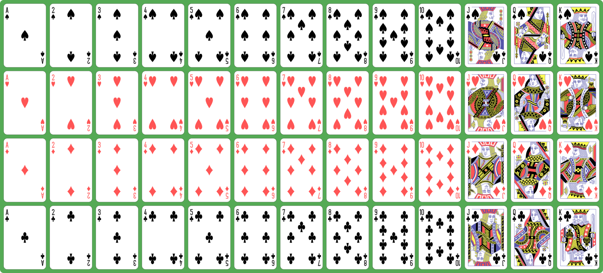
My aim is to create playing cards and I was entertaining the thought of creating the appearance of the cards purely using Unicode characters and CSS. But then I came across a much more elegant solution. I found this SVG file on Wikimedia that is distributed under CC0 restrictions and therefore can be freely used for any purpose. The file contains images for all standard playing cards in an English deck. Looking at the source code of the SVG I discovered that each card was neatly organised as a single SVG group. This would allow me to manually add symbol tags around the group and make them directly available in react. I saved the file under src/assets/playing_cards.svg.
I like to put all my components in one place so in a new src\components subfolder I created the file Card.tsx. This is what the code for the component looks like.
import React from 'react';
import playingCards from '../assets/playing_cards.svg';
import './Card.css';

export enum CardSuit {
  clubs = 'Clubs',
  spades = 'Spades',
  diamonds = 'Diamonds',
  hearts = 'Hearts'
}

export enum CardValue {
  ace='Ace',
  two='Two',
  three='Three',
  four='Four',
  five='Five',
  six='Six',
  seven='Seven',
  eight='Eight',
  nine='Nine',
  ten='Ten',
  jack='Jack',
  queen='Queen',
  king='King'
}

export interface CardProperties {
  suit: CardSuit;
  value: CardValue;
}

export function Card({suit, value}: CardProperties) {
  return <svg className="card-component">
    <use xlinkHref={`${playingCards}#${value.toLowerCase()}-${suit.toLowerCase()}`}></use>
  </svg>
}
You will notice that I have defined two enums, one for the suit and the other for the value of the card. The enums are strings to allow easy access to the symbols in the SVG file. I am not quite sure yet if I will be using these enums in other parts of the code. In that case, I should move them into a different module. But I will cross that bridge when I get there.
The Card component itself is relatively simple. It takes the suit and the card value as parameters and simply wraps an SVG element that links to a symbol in our playing_cards.svg file. The symbol name is constructed from the parameters passed into the component.
The next step was to create a simple story for the card component that allowed me to view it in Storybook. I created a file src/stories/Card.stories.tsx with the following content.
import React from 'react';
import { Card, CardProperties, CardSuit, CardValue } from '../components/Card';
export default {
component: Card,
title: 'Components/Card',
};
interface StoryCardProperties extends CardProperties {
style: { [key: string]: string}
}
function Template(args: StoryCardProperties) {
return <div style={args.style}><Card {...args} /></div>
};
export const Large = Template.bind({});
(Large as any).args = {
suit: CardSuit.spades,
value: CardValue.ace,
style: {
width: 380,
height: 560,
backgroundColor: '#008800',
padding: 10
}
};
export const Small = Template.bind({});
(Small as any).args = {
suit: CardSuit.spades,
value: CardValue.ace,
style: {
width: 200,
height: 290,
backgroundColor: '#008800',
padding: 10
}
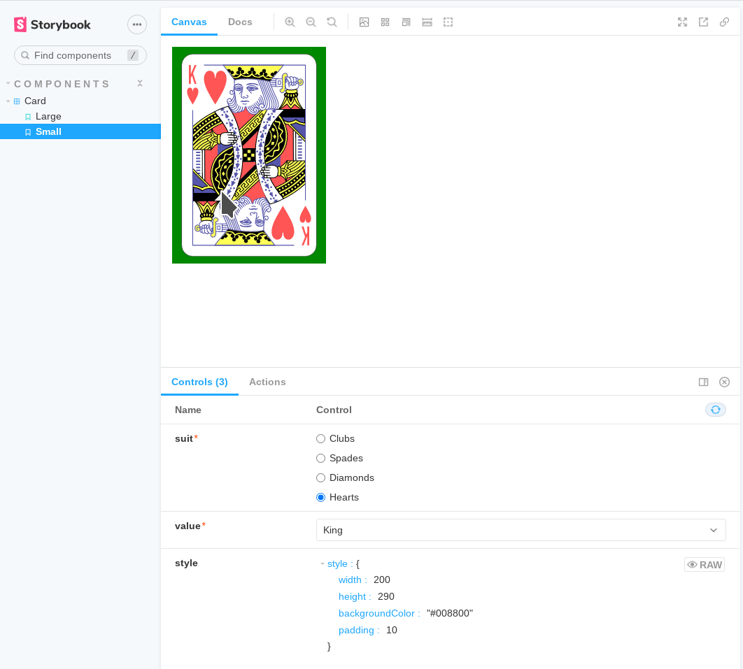
};If you look closely, you will notice that the story is showing the card inside a div with a coloured background. I did this because the Card component doesn’t have an intrinsic size other than the SVG size. The container is needed to show that the card will adjust to different size layouts. I personally find it a bit annoying that I have to cast the stories Large and Small to any to be able to assign the args property. Maybe I’m doing something wrong here, or maybe the Storybook developers haven’t given enough attention to the TypeScript bindings. To start Storybook, I ran the command
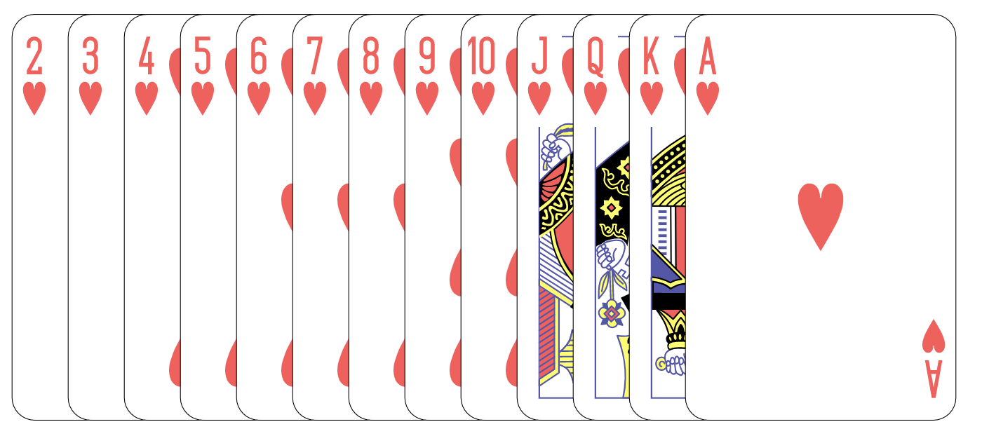
The image below shows how the Card component looks inside Storybook.
The picture shows the way the card will look once I’m done. But I still have to edit playing_cards.svg so that the individual card symbols are defined correctly. Fortunately, I can edit the SVG and watch the effect of my changes directly in the browser through Storybook. I am not going to paste my edits here. This image shows an example of me editing the code.
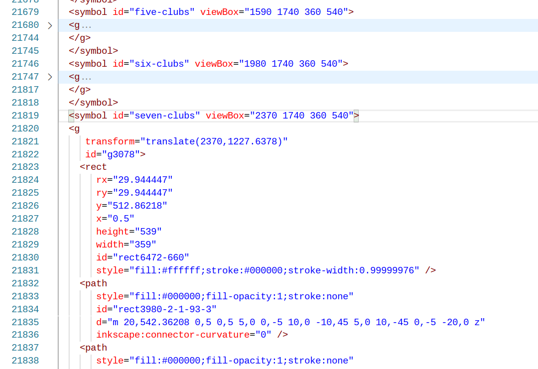
The most important aspect of the edits is to get the viewBox right for each of the cards. You can also see the IDs of the symbols that need to match the card’s suit and value enums.
Conclusion
By creating a simple Card component, I have taken one big step in creating my solitaire game. Cards will be stacked to make the piles and I will have to create a way that the user can interact with the cards and the piles when playing the game. Right now the card is a passive component without any user interaction. My plan is to place all the code for the interactivity into a Pile component that will act as a container for one or more cards. But this will be the topic for my next post on this solitaire game.

Fifty Solitaires – A Beginning
Posted 22nd September 2021 by Holger Schmitz
Many years ago, when I was a physics student and I was just getting to know the ins and outs of programming, I made a bet with a friend of mine. At the time my mother was into solitaire card games, the ones with real cards you play on the kitchen table. This was before everyone had a computer with a built-in little solitaire game. She was given a book with the rules of 50 different games. The bet I made with my friend was this. During the summer holidays, I would be able to write a solitaire game for the computer. The game would not just allow the player to play one type of card game. No, the game should contain all 50 different rules. The stake of the bet was a crate of beer.
So when the holidays started, I set about writing the game. The programming language at the time was Turbo Pascal and the user interface was character-based with special symbols used to create the graphical appearance of the cards. Turbo Pascal was object-oriented, allowed to react to mouse interactions and, as far as I recall, provided an event-based API for implementing the user interface. At the end of the summer holidays, I had a working solitaire game and I enjoyed my well-earned crate of beer with my friends. I had also gained lots of experience in application development and object-oriented programming. Unfortunately, the game does not exist anymore. It was stored on old 5.25-inch floppy disks which after some years became unreadable.
Game design
Today, I want to recreate the game and make it available for anyone to play. Of course, I won’t be using Turbo Pascal and character-based GUIs. I am going for a JavaScript-based game that will be using React for the user interface. For most of my life, I have been programming in strongly typed languages, so I am going to use TypeScript which adds typing to JavaScript applications and makes everything a bit more predictable.
In recent times, the functional programming style has become popular in the JavaScript community, especially when React is being used. I want to try and follow this style for the front-end. I was thinking about using Redux to manage the state of the application. Redux imposes its own functional programming model which is based on reducers. I think Redux is great for many types of web applications.
On the other hand, I still believe that an object-oriented approach is ideal to capture the logic of something like a solitaire game. Let’s think about the way you would implement the game rules. In solitaire, you play different stacks of cards on the table. Each stack might have different attributes that describe its appearance. For instance, a stack may contain cards facing up or facing down. The stack might be spread to reveal some or all of the cards. Then there are the game rules. A stack might allow dropping a card onto it if it meets certain criteria. Or you may be able to pick up a card. Or maybe you can turn over cards that end up in a separate stack.
These rules are independent of appearance and should not be implemented in the front-end. Rather there should be some model that controls the game logic. To me, it feels natural that the model of a card stack should somehow have the rules available at its fingertips. What better way to do this than by creating classes that represent the rules and then implementing the specific rule variants using inheritance.
Creating the Game Skeleton
So, there you go. The game will be written in TypeScript using React, but no other framework will be used. I will be managing the application state directly in the object model that implements the game rules. And I will make that model flexible enough so that I can implement all game variations, simply by plugging different objects together. In the end, I want to be able to read JSON files that specify the rules and construct a game without having to write any additional code.
For today, I will only create the GitHub repo and initialise the skeleton React application. First, I created an empty repository at https://github.com/holgerschmitz/fifty-solitaires
Then, in the folder on my computer where I keep all my source code, I open the terminal and run
The command create-react-app is a useful tool for starting a new React project. Apart from setting up the toolchain for the application, it also sets up a local git repository. I still need to tell git, where the upstream of the project lives. To do this, I navigate into the new project folder and run the following two commands.
I will also be using SCSS for styling. This makes it possible to keep colour definitions and other useful mixins in one place. The command for including SCSS in this project is
This is it for now. You can look at the repository on GitHub. I invite you to think about the next steps and how you would approach implementing the game.