Fifty Solitaires – It’s in the Cards
Posted 8th December 2021 by Holger
This is the second instalment of my series in which I am developing a JavaScript solitaire game that allows the player to choose between many different rules of Solitaire. As I explained in my previous post, the motivation for this project came from an old bet that I made with a friend of mine. The goal was to develop a program that is able to play 50 types of solitaire games. In the last post, I discussed my plans for the application architecture and set up the React environment. Since then I have been made aware of the Storybook library that allows you to browse and test your react components during development. So I decided to make use of Storybook for this project. If you want to follow along you can find the code at Github.
In this post, I will set up Storybook and create the basic component to display a plain card. To initialise Storybook for my game, I opened up my terminal in the project folder and ran on the following command.
This installs all the tooling required for Storybook. It also creates some example files in the stories subfolder. I don’t need these examples and I also don’t like the way Storybook creates components in the same folder as the story definitions. So the first thing I did was to delete all the files in the src/stories/ folder.
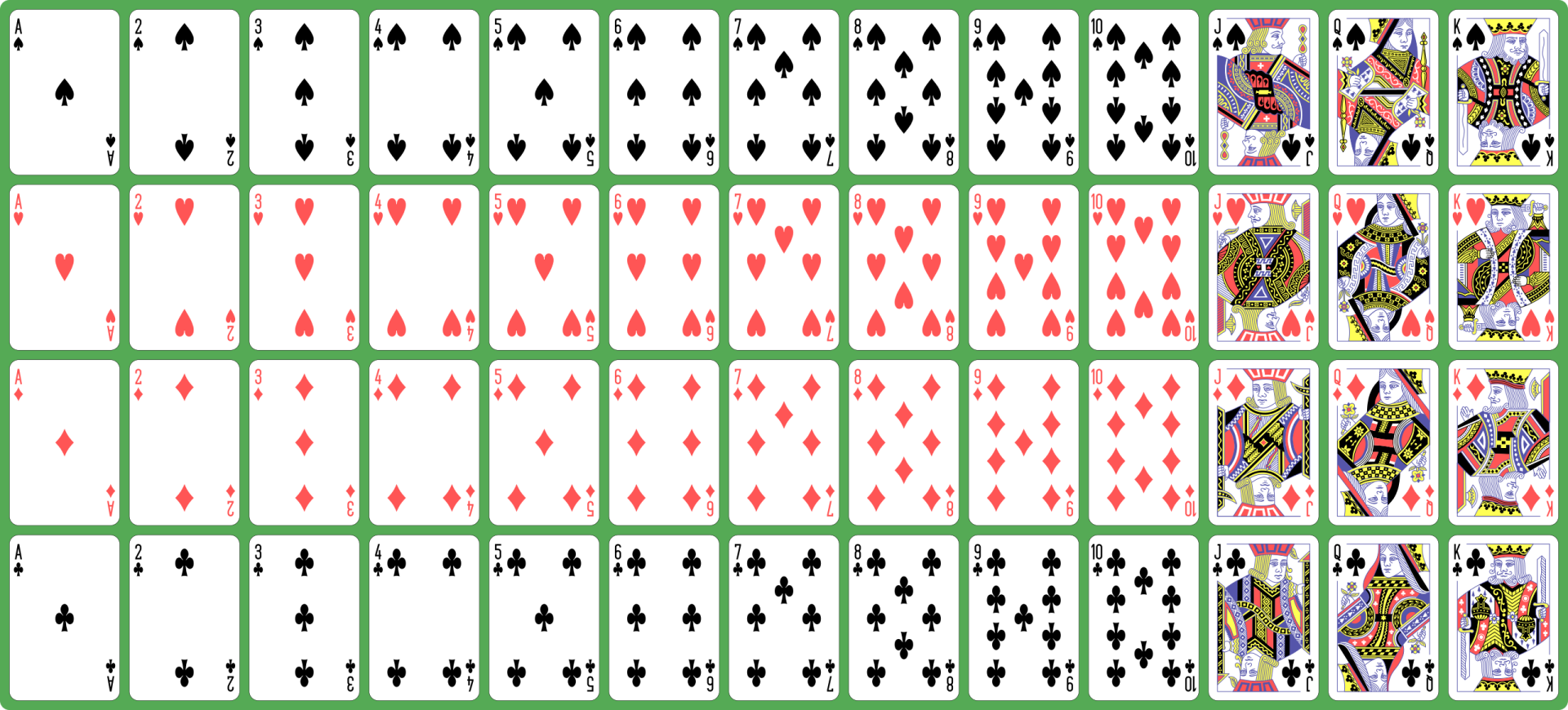
My aim is to create playing cards and I was entertaining the thought of creating the appearance of the cards purely using Unicode characters and CSS. But then I came across a much more elegant solution. I found this SVG file on Wikimedia that is distributed under CC0 restrictions and therefore can be freely used for any purpose. The file contains images for all standard playing cards in an English deck. Looking at the source code of the SVG I discovered that each card was neatly organised as a single SVG group. This would allow me to manually add symbol tags around the group and make them directly available in react. I saved the file under src/assets/playing_cards.svg.
I like to put all my components in one place so in a new src\components subfolder I created the file Card.tsx. This is what the code for the component looks like.
import React from 'react';
import playingCards from '../assets/playing_cards.svg';
import './Card.css';

export enum CardSuit {
  clubs = 'Clubs',
  spades = 'Spades',
  diamonds = 'Diamonds',
  hearts = 'Hearts'
}

export enum CardValue {
  ace='Ace',
  two='Two',
  three='Three',
  four='Four',
  five='Five',
  six='Six',
  seven='Seven',
  eight='Eight',
  nine='Nine',
  ten='Ten',
  jack='Jack',
  queen='Queen',
  king='King'
}

export interface CardProperties {
  suit: CardSuit;
  value: CardValue;
}

export function Card({suit, value}: CardProperties) {
  return <svg className="card-component">
    <use xlinkHref={`${playingCards}#${value.toLowerCase()}-${suit.toLowerCase()}`}></use>
  </svg>
}
You will notice that I have defined two enums, one for the suit and the other for the value of the card. The enums are strings to allow easy access to the symbols in the SVG file. I am not quite sure yet if I will be using these enums in other parts of the code. In that case, I should move them into a different module. But I will cross that bridge when I get there.
The Card component itself is relatively simple. It takes the suit and the card value as parameters and simply wraps an SVG element that links to a symbol in our playing_cards.svg file. The symbol name is constructed from the parameters passed into the component.
The next step was to create a simple story for the card component that allowed me to view it in Storybook. I created a file src/stories/Card.stories.tsx with the following content.
import React from 'react';
import { Card, CardProperties, CardSuit, CardValue } from '../components/Card';

export default {
  component: Card,
  title: 'Components/Card',
};

interface StoryCardProperties extends CardProperties {
  style: { [key: string]: string}
}

function Template(args: StoryCardProperties) {
  return <div style={args.style}><Card {...args} /></div>
};

export const Large = Template.bind({});

(Large as any).args = {
  suit: CardSuit.spades,
  value: CardValue.ace,
  style: {
    width: 380,
    height: 560,
    backgroundColor: '#008800',
    padding: 10
  }
};

export const Small = Template.bind({});

(Small as any).args = {
  suit: CardSuit.spades,
  value: CardValue.ace,
  style: {
    width: 200,
    height: 290,
    backgroundColor: '#008800',
    padding: 10
  }
};
If you look closely, you will notice that the story is showing the card inside a div with a coloured background. I did this because the Card component doesn’t have an intrinsic size other than the SVG size. The container is needed to show that the card will adjust to different size layouts. I personally find it a bit annoying that I have to cast the stories Large and Small to any to be able to assign the args property. Maybe I’m doing something wrong here, or maybe the Storybook developers haven’t given enough attention to the TypeScript bindings. To start Storybook, I ran the command
The image below shows how the Card component looks inside Storybook.
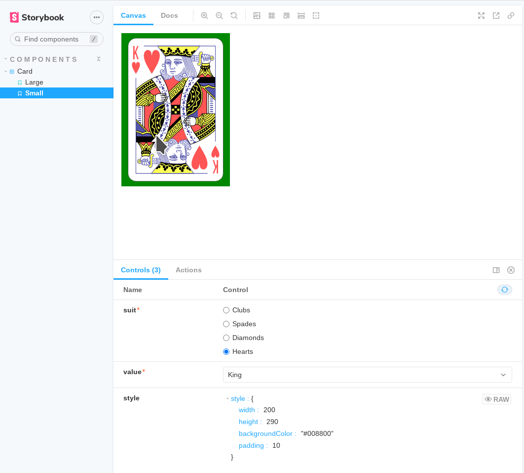
The picture shows the way the card will look once I’m done. But I still have to edit playing_cards.svg so that the individual card symbols are defined correctly. Fortunately, I can edit the SVG and watch the effect of my changes directly in the browser through Storybook. I am not going to paste my edits here. This image shows an example of me editing the code.
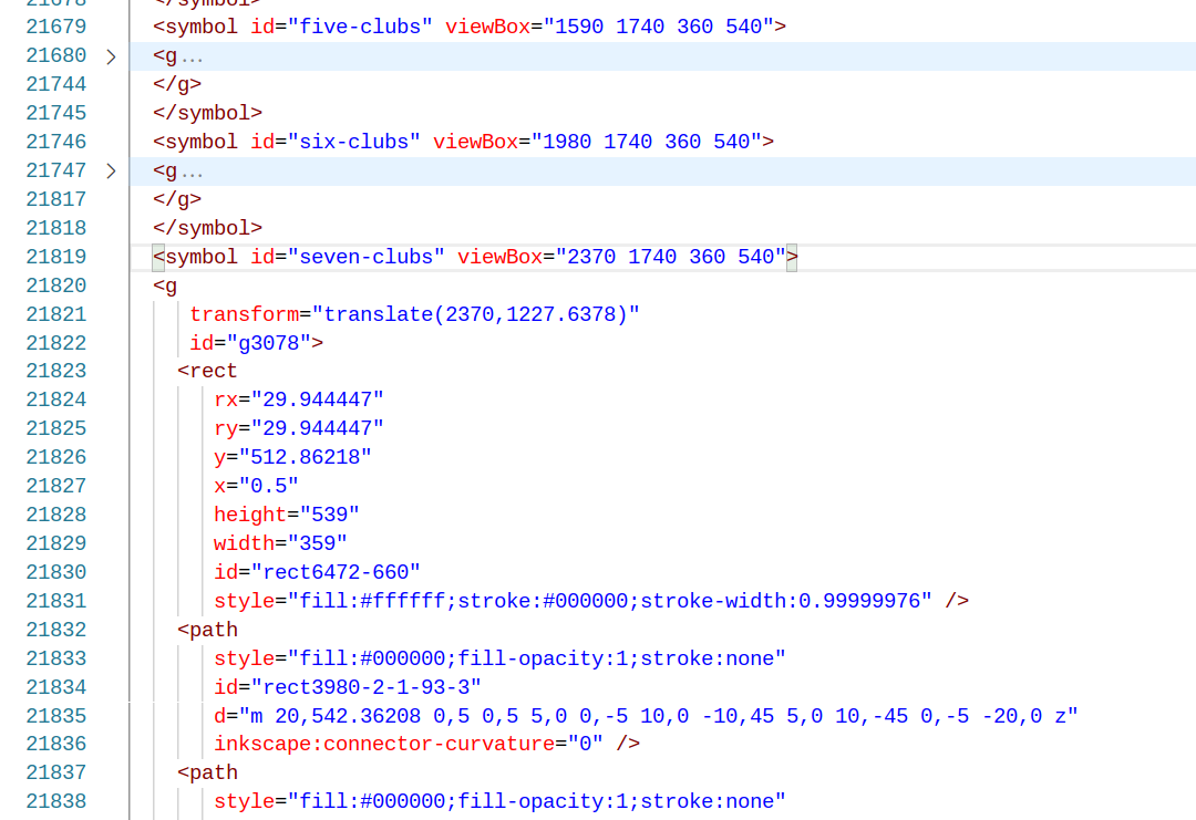
The most important aspect of the edits is to get the viewBox right for each of the cards. You can also see the IDs of the symbols that need to match the card’s suit and value enums.
Conclusion
By creating a simple Card component, I have taken one big step in creating my solitaire game. Cards will be stacked to make the piles and I will have to create a way that the user can interact with the cards and the piles when playing the game. Right now the card is a passive component without any user interaction. My plan is to place all the code for the interactivity into a Pile component that will act as a container for one or more cards. But this will be the topic for my next post on this solitaire game.
Leave a Reply